Pages

Monday, November 24, 2014

Texture in Web Design

The following answers come from tutorial on this site
a. Why have the benefits of texture sometimes been overlooked?
--texture is commonly seen as "busy" and not needed

b. What is the usual difference between a texture and a pattern?
--a pattern is repeated, a texture is usually not repeated.

c. What are 2 ways to focus peoples’ attention using texture?
-- A textured logo on a regular background, and a regular logo on a textured background.

d. How can texture enhance the structure of your information?
--can be used to guide the eye.

e. How does texture enhance the identity or atmosphere of a site?
--texture can be used to help a user identify a site.

f. Describe in your own words what is meant by the following tips:
-i. Maintain Legibility

--don't let the texture make the text too hard to read

-ii. Don’t Beat a Dead Horse.
--don't use too much texture.

-iii. Practice Means Improvement.
--experiment with designs and textures.

-iv. If It Serves No Purpose, Take it Out.
--if something is not needed, do not have it in your site.

-v. Consider the Effect You Are Trying to Achieve.
--use texture to help you make the site better and what you want the site to do.

-vi. Collect Resources so you Don’t Have to Search Later
--download and archive resources when you find them.

-vii. Learn Masks
--learn how to use photoshop masks

-viii. Don’t Sacrifice Quality for Loading Time
--don't have a high quality if it takes ages to load the page.

-ix. Choose Textures Logically
--don't use bad textures for what your doing

g. What are 3 different ways you can come up with your own original texture images?
--1. take your own pictures
--2. scan pages
--3. use noise

Thursday, November 6, 2014

CSS Zen Jabberwocky

Recently we have been doing a project based not on html, but css. Our job was to take a html page and make it what we want it to look like by using css.
My sketch


The page I made
The page I made differed from the sketch so much because I did not account for the position of the items in the code.
The website is here

Tuesday, October 21, 2014

UX eBay.com

eBay home page
Recently I did a usability/readability/utility test for ebay.com. Out of 50 points, eBay received 49 from me. I believe that eBay is an easy to use site that is clear on what to do on the webpage. The only points they missed were from having tabs that weren't super clear that they were tabs. Other than that one blemish, I really believe that eBay is a really good site, and can be used as an example for other sites.
A view of the product listings of eBay

Wednesday, October 1, 2014

Dont make me think - Ch. 2-3

This website shows:

  • Excessive busy-ness
  • a site not split into defined areas

This website shows:

  • links that are not obvious
This website shows:

  • clearly defined areas
  • visual hierarchies
  • obvious links
This website shows:

  • Little competing noise
  • Good use of conventions


Tuesday, September 30, 2014

"Dont make me think"

Observations for site 1:

  • Where do I find class assignments?
  • Is the search bar searching everything?


Observations for site 2:

  • Where do i sort my data?
  • Where do i go to share a folder?


Observations for site 3:

  • Are there more topics than shown?
  • Is there a place to narrow the stories by date?

Friday, September 26, 2014

Storytelling vs. Reconciliation

  • What happens when news media outlets cease to be objective reporters of fact, and start trying to tailor their story to the biases of their readers/viewers/listeners?
When media outlets start tailoring their media to certain crowds, which I believe is already happening, things begin to become clouded and the truth will not be known by the general population.
  • What is it about our social media feeds that tends to feed our preconceptions or biases, instead of giving us an objective view?
We go to social media to be social with friends and family, social media expects us to just want to see our views on our news feed. The social media sources expect us to go to someplace like CNN or Fox to get our news.
  • What happens nationally or globally then, when so much of everyone's "information" about an event like this comes from less-than-objective news outlets, or from their own social media feeds?
People will not know the truth like it is supposed to be, their views will be swayed by whatever news source they chose to use.
  • How might this same phenomenon be affecting other areas, such as politics?
The media is usually supporting one side or another. Doing this would sway the vote of something such as a presidential election.

Tuesday, September 2, 2014

Index website revisions

The main thing I did was lower the links on the right to look a little more balanced.

The hardest part about giving feedback is making sure you don't pick out things that you don't like, just things that are bad. Next time I would probably look at peoples websites next to mine to gauge how I see it. The most helpful feedback was critical feedback, it really helped me change things.

Friday, August 29, 2014

Google's Drone by GoogleX

Google recently released info about a drone program, thought of and run by GoogleX, Googles group responsible for innovations such as the self driving car and Google glasses. Google originally meant for the drone to deliver AEDs to heart attack victims, but Google is also looking at other practical applications for their drone. Because of regulations currently imposed by the FAA, Google moved all the work for drones to Australia. The article is here.

I personally am very excited for the future where projects like this are allowed by the FAA. My question for these projects is, is it profitable to have so many of these to actually cover a large portion of the United States. It seems impractical to have one of these drones every 1 or so kilometers. There is also the issue of getting the product to the drone so it can deliver. Wont it take as long to get a product to a drone near you as it will to just ship it straight to you?

Friday, August 15, 2014

WayBack Machine

Google.com:
Old Site:
New Site:

This website has changed greatly from the past Google websites. For the most part, the general design is the same old and new. One of the main differences is that the newer site is a lot simpler than the old site. Also, instead of having links just on the page, the new site has a drop down box to show you all the Google services.

Old Code:
 New Code:
As you can see, there are major differences to the code of the old and the new website. In the old website, I can clearly pick out parts of code that i recognize, but in the new code, I am unable to find much code I recognize at all. In the new website, there are a lot of scripts and in the old, there are not.

Edmodo.com:
Old Site:
New Site:

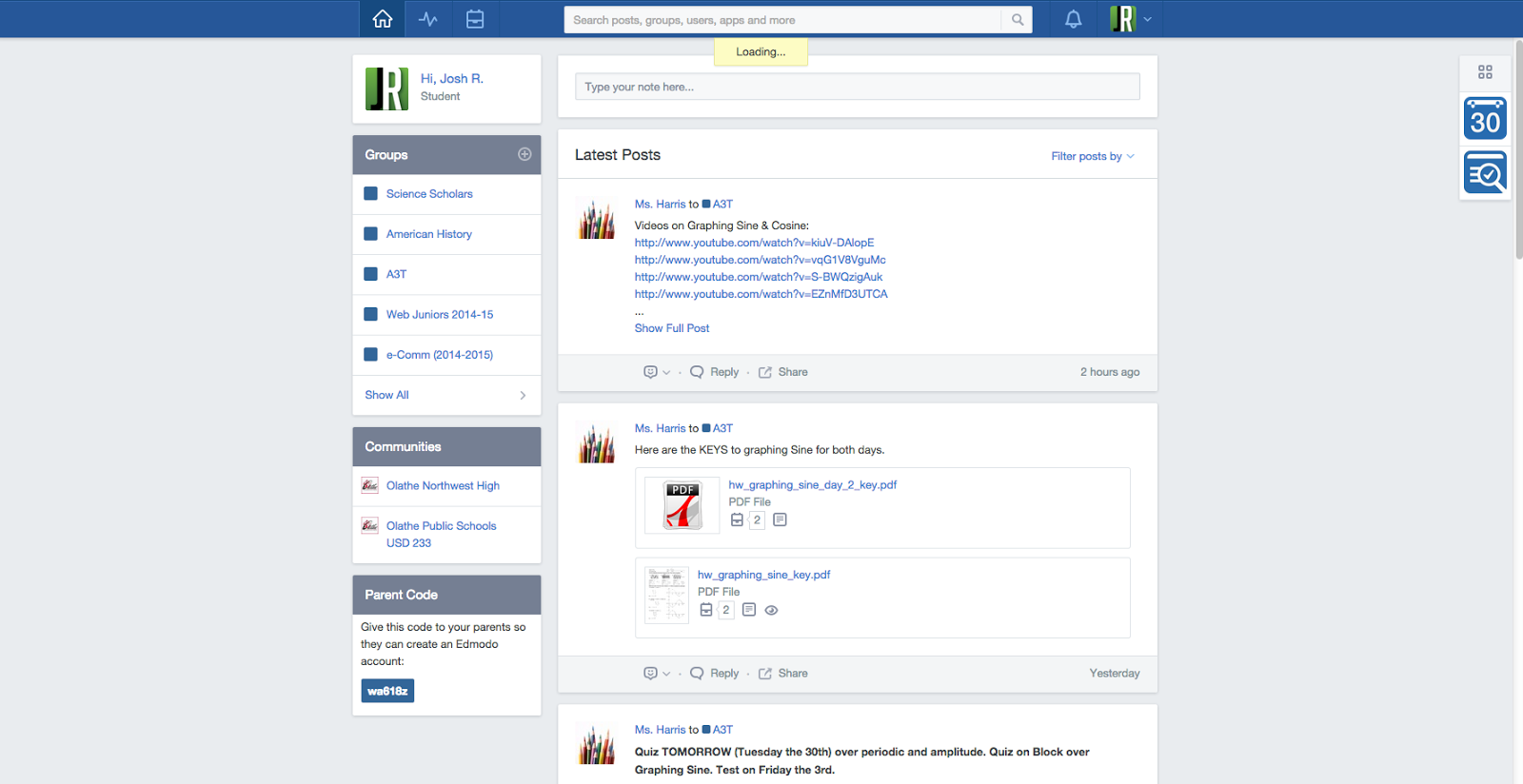
The Edmodo website has changed greatly over the years. The older website is not much more than a login and maybe a picture. The new website has a awesome design that uses pictures excellently and mimics the design of Facebook, which allows us kids to automatically know how to use most of the website.

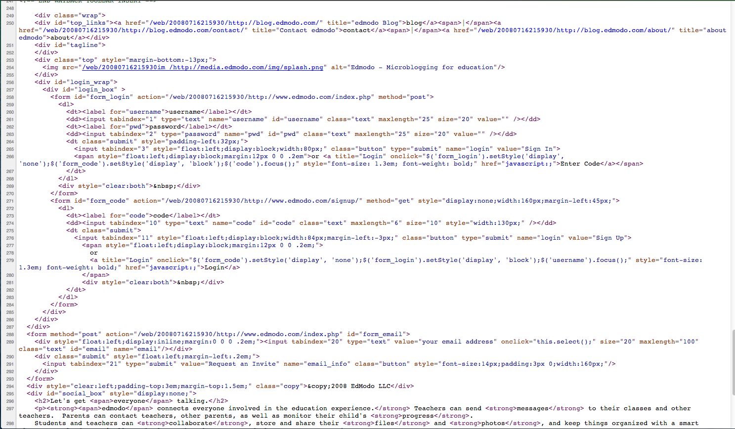
Old Code:
New Code:

The main part of the code for Edmodo looks the same, there are easy to recognize html tags. The new code looks much cleaner and more organized at the start, but later on it sort of goes back to the way Google does it, which is complicated and difficult to understand.

Twitter:
Old Site:
New Site:

The Twitter website has evolved a lot over the years. A huge design change was the addition of a picture in the background that constantly changes. The login is a lot cleaner and there isn't anything in the middle of the page distracting you from logging in.

Old Code:
New Code:

One main difference is the organization of the code. The newer code is a lot cleaner and neater than the old code. It's interesting to be able to look at the old code and see the login boxes laid out in code. The newer code probably has the login boxes and script sort of hidden.

The purpose of the WayBack machine is to archive almost every website on the internet to create a database of old websites. The machine not only gets websites, but also the images on those websites and any software. I find it interesting that the internet archive has been a part of several legal case related to past websites.


Friday, May 16, 2014

Fun at OMB Guns

So, on May 13, it was my birthday. Being the person that I am, I decided I wanted to go the gun range. We went to OMB Guns. I got to shoot a 9mm CZ, an AR-15 Bushmaster, and an MP5. I had tons of fun, below is a video of me shooting the MP5.

Monday, April 28, 2014

New Personal Logo!!

I recently made a new personal logo. As you can see, I have set it as my banner image, as well as the favicon. I used illustrator to make this logo, and had many attempts before I got a logo I liked.
This is my new logo:
This is the art board that I made my logo with:


Friday, April 25, 2014

Google Maps Easter Egg

I found a neat easter egg on google maps, you can go into the tardis... Go to This link, and take a look around the tardis.

Friday, April 11, 2014

Kerning Game


Check out this game that helps you understand the balance between characters in a typeface. The game is pretty hard, but you will eventually get the hang of it. I ended up getting a 100/100 after my first few tries, take a look at the game here.

Friday, April 4, 2014

Google Logo


The Google logo is widely known, but not really understood. One part of it, is the color, which shows that Google does not follow the rules with just one color. You can check out the Wiki Page for the Google logo here. The modern Google logo has just flat colors, but earlier logos had gradients and bevels on them to give a sense of perspective.

Saul Bass Movie Poster

This is my poster that is modeled after the style of Saul Bass. You can check out some of his other posters Here. His posters are minimalistic, and have very few elements. In addition to few elements, He also uses few colors, the color scheme usually includes black and white. This is a poster for Monty Python and the Holy Grail. It depicts a scene in the movie where a woman is told that if she weighs as much as a duck, she is a witch, and she was. Below is an example of a Saul Bass movie poster.


10 things I can't live without: Poster

This is my poster that i made in inDesign. It shows 10 things, along with descriptions, of what i cannot live without, and need in my life. I had some help with my descriptions and my picture. Mason made my description, and Steven took my picture. I loved using the rounded corners for the pictures on the bottom. Check it out!

eMagine coming up!

So the eComm media festival, eMagine, is coming up this saturday. Students from across the Johnson County area have entered in their works for judging. You can check out the eMagine website here. I am helping with the sound board during the show, so you can look back at me in the booth. Hope to see you all there.
The eMagine background from 2013

Monday, March 31, 2014

Responsive Web Design

What is responsive web design?

Responsive Web Design (RWD) is a Web design approach aimed at crafting sites to provide an optimal viewing experience—easy reading and navigation with a minimum of resizing, panning, and scrolling—across a wide range of devices (from mobile phones to desktop computer monitors).


Why has responsive web design become so important?

Interacting with websites on smartphones and tablets is not the same as doing that on a desktop computer monitors. Factors such as Click versus Touch, Screen-size, Pixel-resolution, support for Adobe’s Flash technology, optimized markup and many more have become crucial while creating websites with Responsive Design.


What are media queries?

Media Queries is a CSS3 module allowing content rendering to adapt to conditions such as screen resolution

what are breakpoints in responsive design?


Break points in RWD are browser widths that have a media query declaration to change the layout once the browser is within the declared range.


_______________________________________________________


Responsive Web Design Examples: Rally Interactive Website


Largest window: You can see that it has the 3 columns of triangles, the most of all the window widths


Medium window: has 2 columns of triangles, smallest width that has the arrows to the sides of the header.


Small window: has only 1 column of triangles, also does not have arrows left and right. Social network buttons have been removed, and the logo now appears on top of the page choices instead of at the side.

Tuesday, March 25, 2014

Graphic Design Final

Q: how do the things i value reveal my personal story?

A: My values probably reveal a lot about who I am and what I like. I've been sort of a geek all my life, and i show that through my computer and how much i love technology. I've also been told all my life that I am a natural leader, and i show that in Boy Scouts. I value the things that represent me and what I do. I think the things someone values really tell someones story.

Monday, February 10, 2014

Vector Based Web Design Examples

Today I looked at many examples of web design using vector based graphics, here are my favorites.

enviramedia: I liked this design because of the look of a sideways landscape with flowers and plants growing to show media.

mobilestatistics: I liked this site because of the lines on the background, it made it look like a design sheet or a piece of graph paper.

Wednesday, February 5, 2014

OA check in database

This is a picture of the Order of the Arrow Database that I have created for weekend check-ins. I used Microsoft Access to create this database, and it will be loaded with lots of data about our members. This database took me about 10 hours to create and fix some issues, but it also took about 3 hours to learn how to make it. I used the tutorials on Lynda.com to help me.
 

Monday, February 3, 2014

Hexagons Background

I made this background in Photoshop, I used a brush to make the hexagons, then I messed with different layers and layer styles until i got this.

Web Design using Illustrator.


  • Put in a blank browser in illustrator to give you an area to work, lock that layer!
  • use RGM mode
  • hide page tiling and art board
  • set all units to pixels
  • set keyboard increment to .5 pixels
2nd link: reasons to use illustrator for web design
  • its faster than dreamweaver
  • you can make you're webpage modular
  • you can format text quickly and easily
  • you can focus on simple design
  • you can create professional designs

Friday, January 31, 2014

Nerman Museum of Contemporary Art

Yesterday we took a field trip to the Nerman museum at JCCC. We where able to see all of the art there, and it was a pretty cool experience. Below is a panoramic of some art that is actually interactive, if you stand in front of it, it lights up and lights start blinking.  This really connected with me because when you usually go to an art museum, you stand there and just look at the art. With this you get to interact with the things you see on the wall and make them change.